This is a sample of the online training program prepared for business persons who want to learn basic data literacy.
I will provide the program to a company in Bangkok, Thailand in the next month.
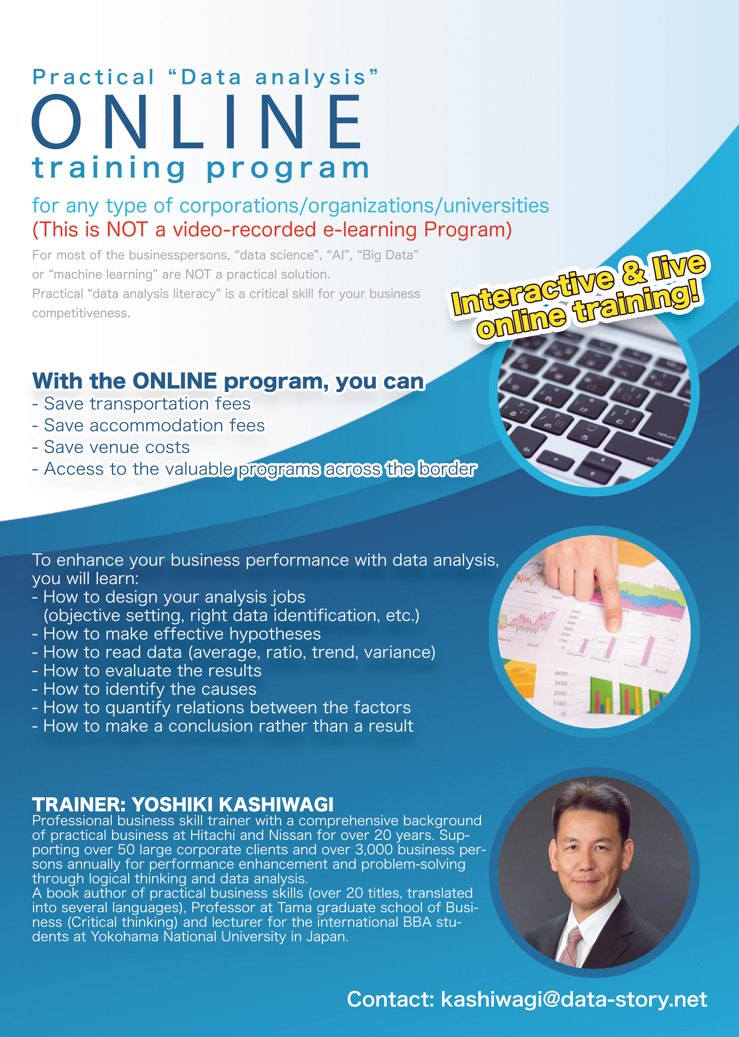
If your organization/institution is interested in those programs, please contact me.
THE OUTLINE OF THE PROGRAM:
Objective and outline
To learn basic data literacy required before data analytics. In the DX/AI era, people are starting business communication with more data. You may also be able to communicate in a more persuasive way with your clients, colleagues, or even your boss by using numbers(data), as data can show more about what you personally know objectively.
In this short program, we do NOT talk about Data science/analytics. It will focus on the fundamental literacy, which enhances a part of your business skills.
Agenda – subject to change
Data for your better communication
What data can do for you
STEP1: Create your message
STEP2: How to quantify your message
STEP3: How to effectively visualize the message
For further study
Q&A
Duration
Max. 90 min. including Q&A
Venue & language
Zoom online in English
Trainer
Yoshiki Kashiwagi
CEO & Founder of Data & Story LLC (Professional Business Problem-Solving and data analytics Skill Trainer) Visiting Professor at Tama Graduate School of Business (“Critical thinking”)
Getting the Go-Ahead: Using Statistical Analysis To Maximize Your Business Plans
My best-selling book, currently 14th re-printed in Japan, has been released in English this week.
The book is about “practical utilization of statistical data analytics” for business planning. I believe that there are huge numbers of books about data analysis/statistics but they are too academic to apply for business.
I hope you will enjoy the book which you have not yet experienced with other “data analysis” books.
Here is the outline of the book (quoted from Amazon):
•Using Data in Real Life
Are you drowning in a sea of data? Are you tired of struggling endlessly with numbers, charts and graphs? Do you get lost or fall asleep when you read books on data and statistical analysis? You don’t need to be a mathematician to utilize data. Knowing how to apply data is more important than researching complicated analysis techniques. Learn how to set the goal of your analysis and determine what type of data you really need to tell your story more efficiently and effectively.
Most books only describe how to analyze data, visualize data or how to make a presentation. This book, however, covers all the steps to take before and after analysis, and any other practical skills you need, such as knowing what type of data to search for, where to find it, and how to share the information to an audience. At the end of the book, the author provides his LinkedIn information for readers to contact him for any further guidance. The author has experience in teaching analysis seminars.
•Analysis Tools, Excel Charts and Visualization
This book introduces analysis tools to the layman in plain English, such as hypothesis testing, standard deviation, correlation analysis and regression analysis. This information is sufficient enough in applying data analysis to your day-to-day business activities. This book also includes a step-by-step guide of Microsoft Excel to calculate the average, median and standard deviation, to assess risk, to do correlation and regression analyses, and to create charts and graphs. You will be able to visualize data with scatter diagrams, histograms and Pareto charts with Excel, and will only need minimal mathematical knowledge (e.g. the linear function y=mx+b). For the more advanced analyst, the book has a column at the end of each chapter that explains analysis or research techniques in further detail.
•Learning Through Relatable Examples
This book uses many real life examples in entering in a new market to describe how to assess the market size and target population, set a sales target, choose cost-effective promotional strategies, and estimate profit and risk. The dialogues between a rookie salesperson and his boss make it easy to understand common analysis mistakes and how to avoid them. The author introduces not only the benefits but also the limitations and pitfalls of analysis. For instance, data can be misrepresented with the average and normal distribution. The average is often misused to determine the characteristics of the whole data set (e.g. feeling relieved that your test score is above the class average), even though data distribution may be skewed in reality. The author also explains spurious correlation which may lead you to believe that “successful businessmen wake up early.”
•Choosing the Right Data and Making an Effective Presentation
You will learn how to collect, select, process, and compare data by converting absolute values into ratio (e.g. per capita), as well as make an effective presentation with visualization and narratives, thus bridging the gap between analysis and presentation. You will be able to break down the analysis results and tell a story, making the information more approachable to the audience so that they can make decisions and take action based on it. The author shows how he changes his presentation style based on his goal and target audience.
Furthermore, he provides tips on how to explain why you chose a particular scope of data, and how to look out for misleading or unreliable information when you are an audience of a presentation.
How can you use “correlation” for practical issues?
From this week, we shifted our focus from a single data set to multi data sets.
By using multi data sets, you can apply “correlation analysis” to clarify the strength of mutual relation.
After watching the video, we discussed correlation examples in our daily life and/or social issues.
Based on the ideas raised in the class discussion, the students started collecting related data and summarise the correlation analysis results to be presented in two weeks.
This is a live online class under the Covid-19 situation. But I am sure that online class works well/better even without the Covid-19 issue. It all depends on how effectively you facilitate the class online.
Now, “Online” completely removed the distance issue. It is possible to give my online lectures across the world as some students already join my class from outside of Japan even now.